Capabilities

Wayfinding

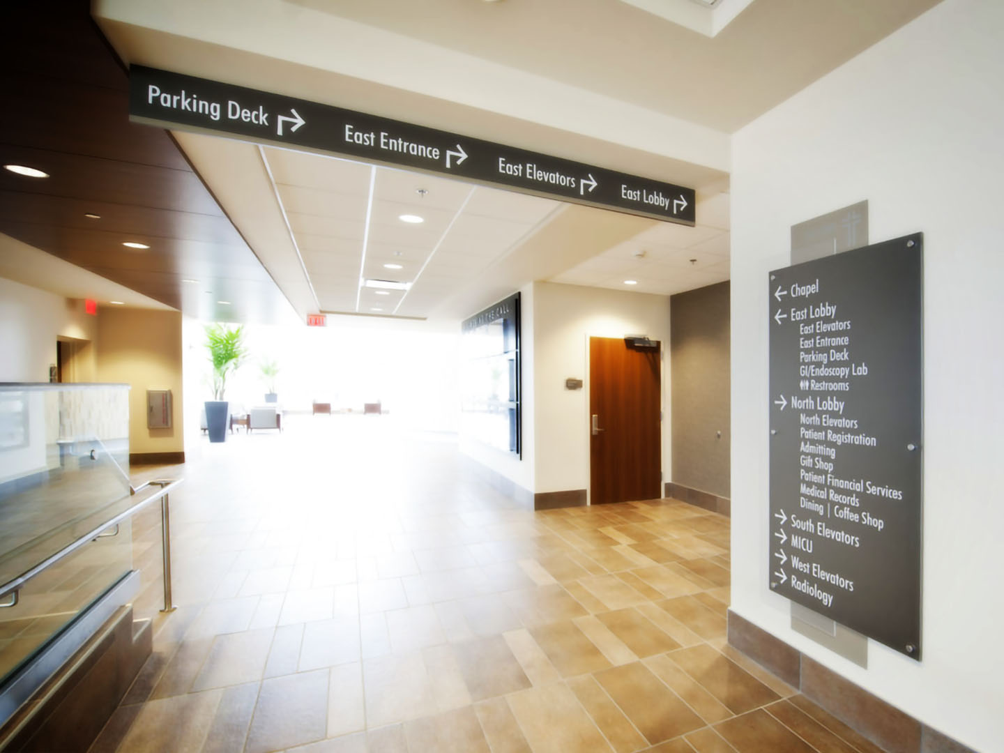
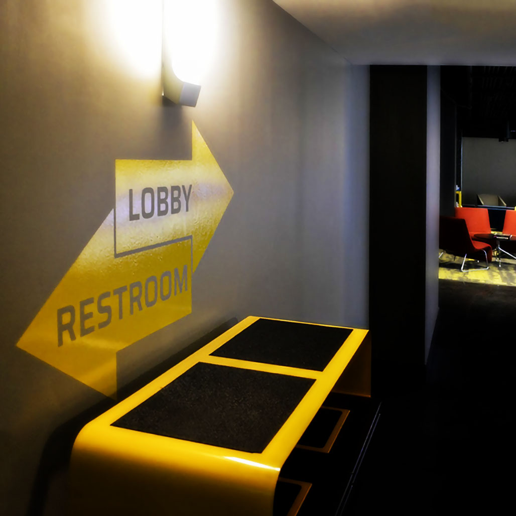
Great wayfinding offers clear direction, is accessible, and blends effortlessly into the environment.

Our experience allows us to guide our clients through this process.

Like some individuals, facilities can be directionally challenged, whether it be the general architecture or additions to the facility over time that have created difficulty in navigation. However, there are several key principles to keep in mind when developing an effective wayfinding plan:


It is important to create directional systems that remain consistent throughout the user experience. Set a standard, stick to it, and maintain it continuously.

When a visitor reaches a point on a given route where alternative paths are presented, they need to know what to do next. Determine what points along the path require a decision and provide the necessary guidance to the user. Sending a user down a certain path only to have them reach a decision point with no additional information causes frustration and increased anxiety. This in turn causes a user to abandon your system.

Too much signage can be overwhelming… we refer to this as “Visual Clutter”. This is often the result of a poorly maintained wayfinding system where more signage (often hand-written sheets of paper taped to the wall) is added by staff to help users… this can lead to multiple signs (of varying levels of legibility) at the same decision point. Most often, users when confronted with this, no longer see/read any of the signs and become frustrated.

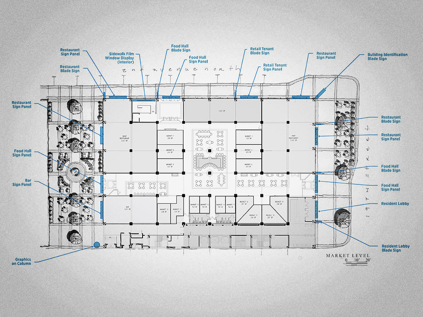
Survey staff and visitors to identify areas of concern/confusion for visitors. Determine the most important destinations and create directional information in a sequence that matches the visitor path through your facility or campus.

In many facilities (particularly in healthcare) there is a continuous consolidation of departments, changing entry points and areas. Wayfinding needs to be updated to match these changes or all of the time, effort and money spent will provide diminishing returns. But the necessary responsibility may get delegated to departments without budgetary support or priority. We view the maintenance of wayfinding systems as marketing expenses because the user experience is directly linked to customer satisfaction.

Our experience allows us to guide our clients through this process.

Like some individuals, facilities can be directionally challenged, whether it be the general architecture or additions to the facility over time that have created difficulty in navigation. However, there are several key principles to keep in mind when developing an effective wayfinding plan:
It is important to create directional systems that remain consistent throughout the user experience. Set a standard, stick to it, and maintain it continuously.

When a visitor reaches a point on a given route where alternative paths are presented, they need to know what to do next. Determine what points along the path require a decision and provide the necessary guidance to the user. Sending a user down a certain path only to have them reach a decision point with no additional information causes frustration and increased anxiety. This in turn causes a user to abandon your system.

Too much signage can be overwhelming. We refer to this as “Visual Clutter.” This is often the result of a poorly maintained wayfinding system where more signage (often hand-written sheets of paper taped to the wall) is added by staff to help users. This can lead to multiple signs (of varying levels of legibility) at the same decision point. Users, when confronted with this, may no longer see nor read any of the signs and become frustrated.

Survey staff and visitors to identify areas of concern/confusion for visitors. Determine the most important destinations and create directional information in a sequence that matches the visitor path through your facility or campus.

In many facilities (particularly in healthcare) there is a continuous consolidation of departments, changing entry points and areas. Wayfinding needs to be updated to match these changes or all of the time, effort and money spent will provide diminishing returns. But the necessary responsibility may get delegated to departments without budgetary support or priority. We view the maintenance of wayfinding systems as marketing expenses because the user experience is directly linked to customer satisfaction.

Sign up for Fravert News